

Understanding the Dashboard
The Ferretly dashboard provides insights into the subject's posts. The dashboard includes key analytics including subject properties, flagged post summary, score, behavioral composition, word cloud, sentiment over time, and OCEAN personality.

To access the dashboard, click Dashboard in the left navigation. The button may appear as a graph icon depending on your screen size.
By default, the dashboard will show the most recent subject’s data. Note that if you haven’t added any subjects yet, the page will be blank.

Click the dropdown in the top left of the dashboard in either to select a different subject.
Once you select a subject, there’s a wealth of information in the different dashboard components or cards. We’ll break each component down below.

Subject Information
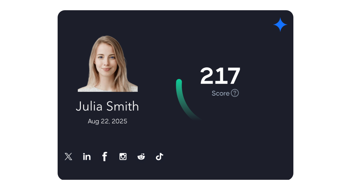
The top left card displays the subject's name, profile picture, date of the last social media report, and linked social media accounts. On the top right of the subject card, you can click the icon to display the flagged post summary.
Hovering over the subject's name will show a tooltip that includes additional information including the number of posts analyzed and flagged post counts. You can click the name to display the complete subject summary.
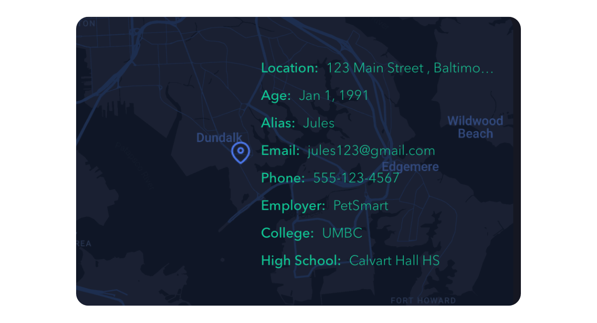
Below the subject card you will find the subject properties overlaying a map that indicates the subject's location.

Behavior Summary
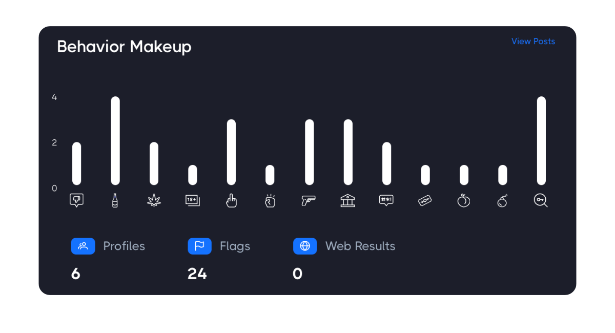
The top middle card provides a behavior makeup which includes the count of flagged posts by behavior. Hovering over the behavior bar in the graph will display actual count. Below the graph you will see the number of social media profiles, count of flagged posts and number of web posts returned for the subject.
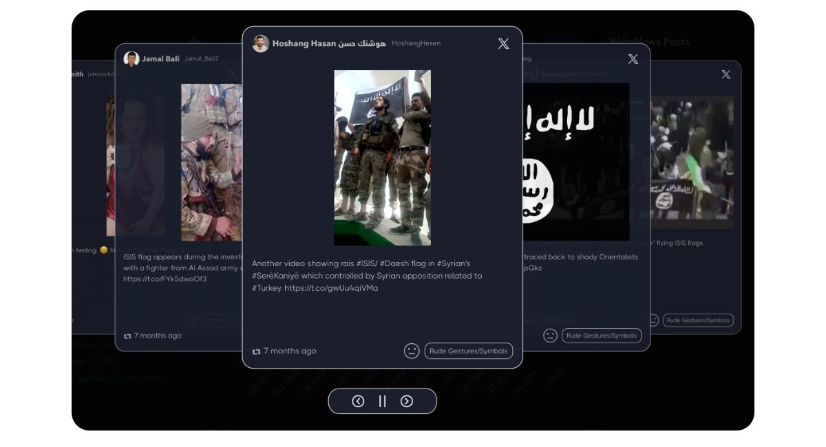
You can display the flagged posts for the subject by clicking the view posts link in the top right corner of the card. This will show the flagged posts in a carousel that automatically rotates through each. Or you can manually click through the posts by using the navigation arrows below. Click the X or hit ESC key to go back to the dashboard.

Word Cloud
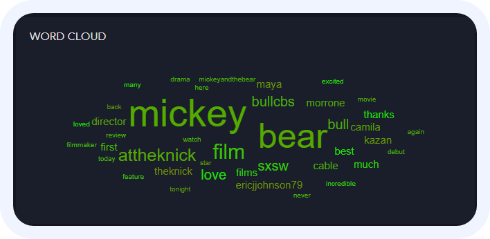
The word cloud visually represents the most frequently mentioned topics in the subject's posts. Larger words indicate higher frequency, and the color (green or red) indicates positive or negative sentiment respectively. Hovering over a word will magnify it.

Sentiment Over Time
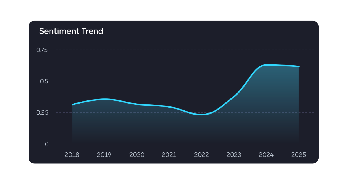
The graph below the word cloud represents the average sentiment of posts over discrete intervals. A green line indicates overall positive sentiment, while a red line indicates overall negative sentiment. Changes in the line can indicate shifts in sentiment over time.

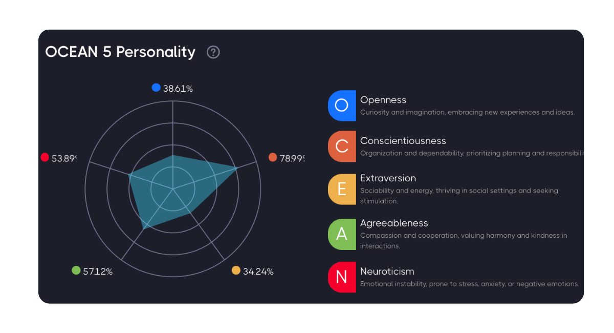
OCEAN Personality
The OCEAN Personality card shows the predicted personality traits of the subject based on analysis of their original posts and comments from social media.
You can learn more about the OCEAN personality by clicking here.

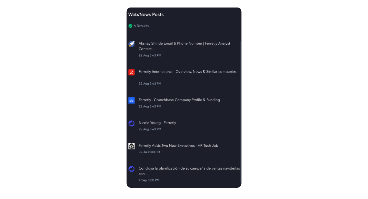
Web/News Media Overview
The card on the right of the dashboard will show all web/news and media results associated with your subject. You can click an article to view the original source.

